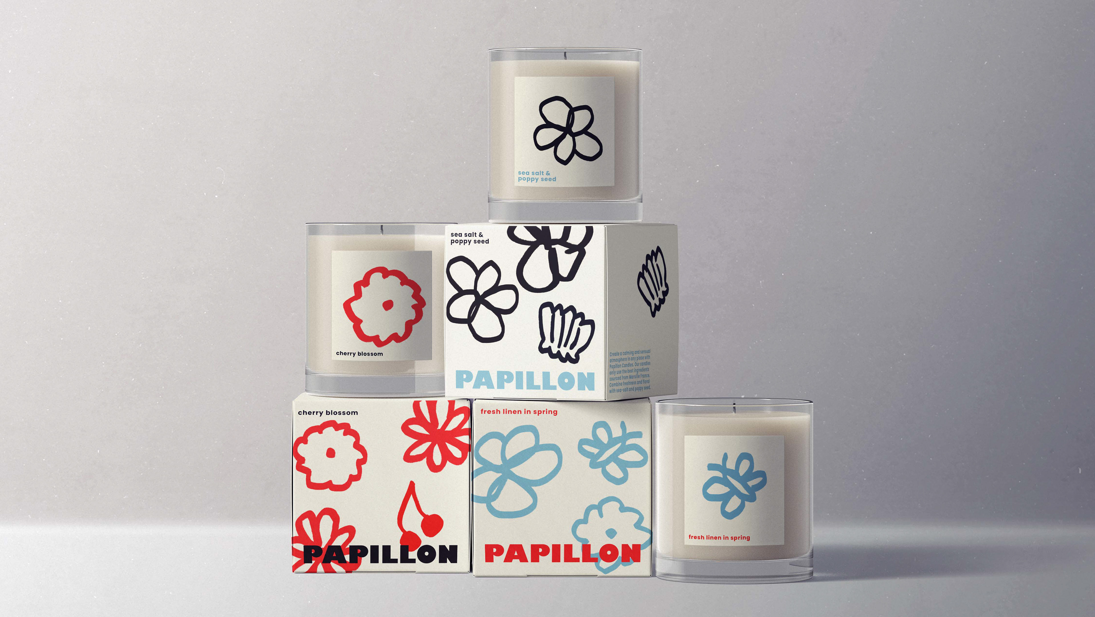
For this university project I re-branded Faraday’s Cage which is a café and artisan bakery located on Gore street, Fitzroy Melbourne. The cafe itself is located in a large heritage warehouse styled building with exposed brick, concrete floors and industrial furniture. Faraday’s Cage’s existing branding takes on a more formal and traditional approach which inspired me to think about the possibilities of how a more modern and playful design could enhance their identity.
The aim of this re-brand university project was to create a new look for the cafe. As they have a very meaningful back story and connection to the building, it was important to carry through these traits in their renewed branding.
The logo typeface was chosen to mirror the heavy and industrial qualities of the cafe building, as well as the deep red to represent the exposed bricks. The curve element references the large curve at the head of the building, as well as creates a playful and modern personality to the branding.
(please note this was a fictitious project created for the purpose of a university project)