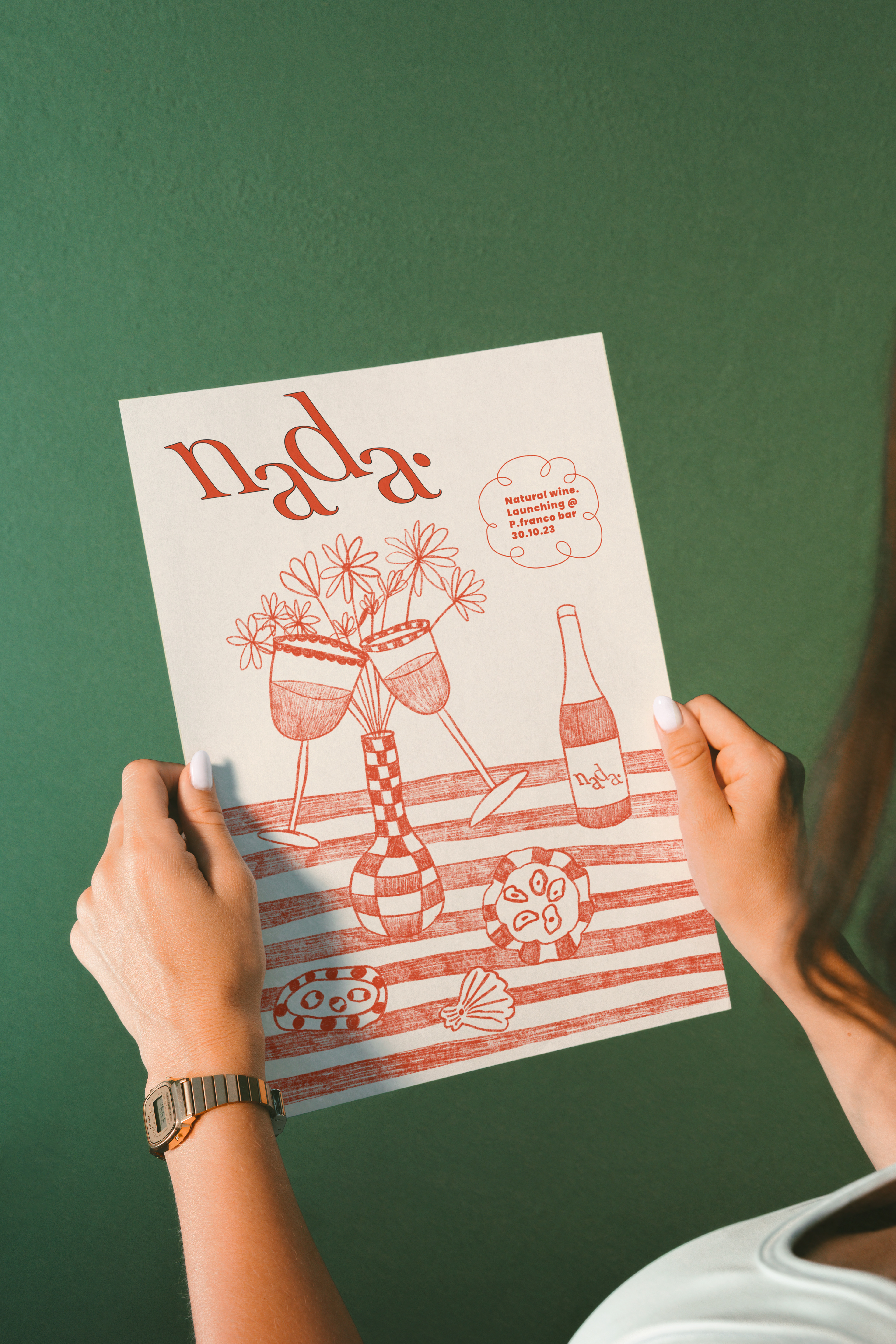

During a visit to the beautiful city of Granada spain, I stumbled across a lovely natural-wine shop called Al Sur De Granada where I did a tasting and learnt a lot about the process and history of natural wine and thus inspired my next personal project. The name Nada is derived from the word Granada.
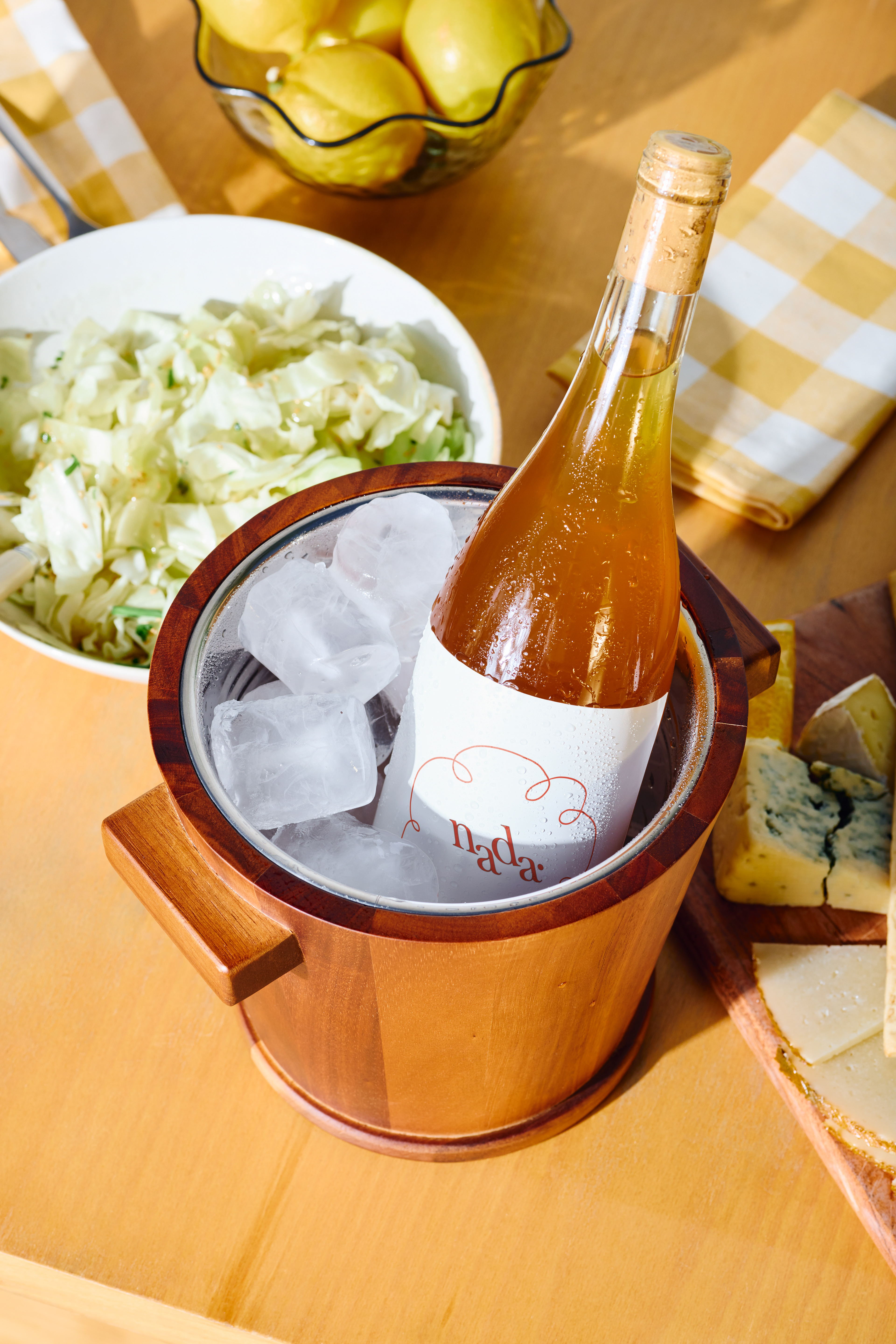
I wanted to create a light and fun design that I could envision on the shelves of Al Sur De Granada. The word Nada is also an informal way say "nothing" or "zero" in English, therefore the cloud like illustration symbolises a "no brainer" mindset that a customer would pick up this wine off the shelf. The use of the vibrant orange colour is to tie in with the colour of the skin-contact wine, also known as orange wine.
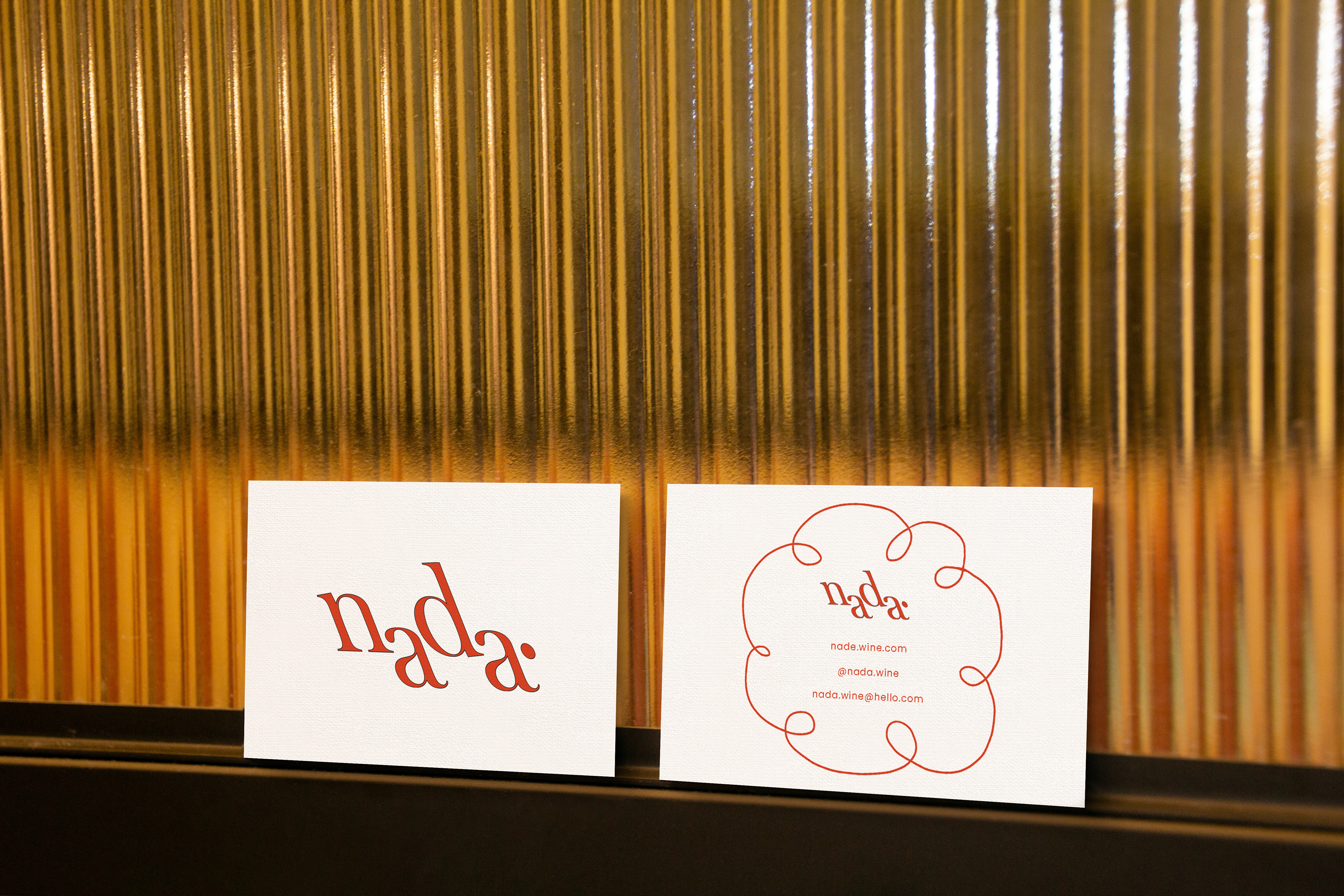
The typeface I chose is representative of the smooth and fresh flavour of Nada. The opposing letters is a representation of people coming together over a lovely bottle.
I wanted to create a light and fun design that I could envision on the shelves of Al Sur De Granada. The word Nada is also an informal way say "nothing" or "zero" in English, therefore the cloud like illustration symbolises a "no brainer" mindset that a customer would pick up this wine off the shelf. The use of the vibrant orange colour is to tie in with the colour of the skin-contact wine, also known as orange wine.
The typeface I chose is representative of the smooth and fresh flavour of Nada. The opposing letters is a representation of people coming together over a lovely bottle.