
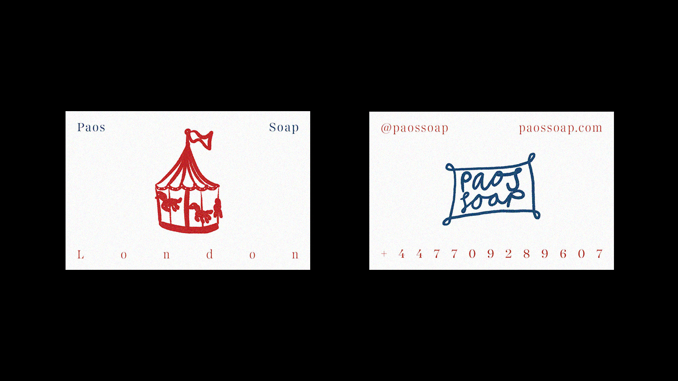
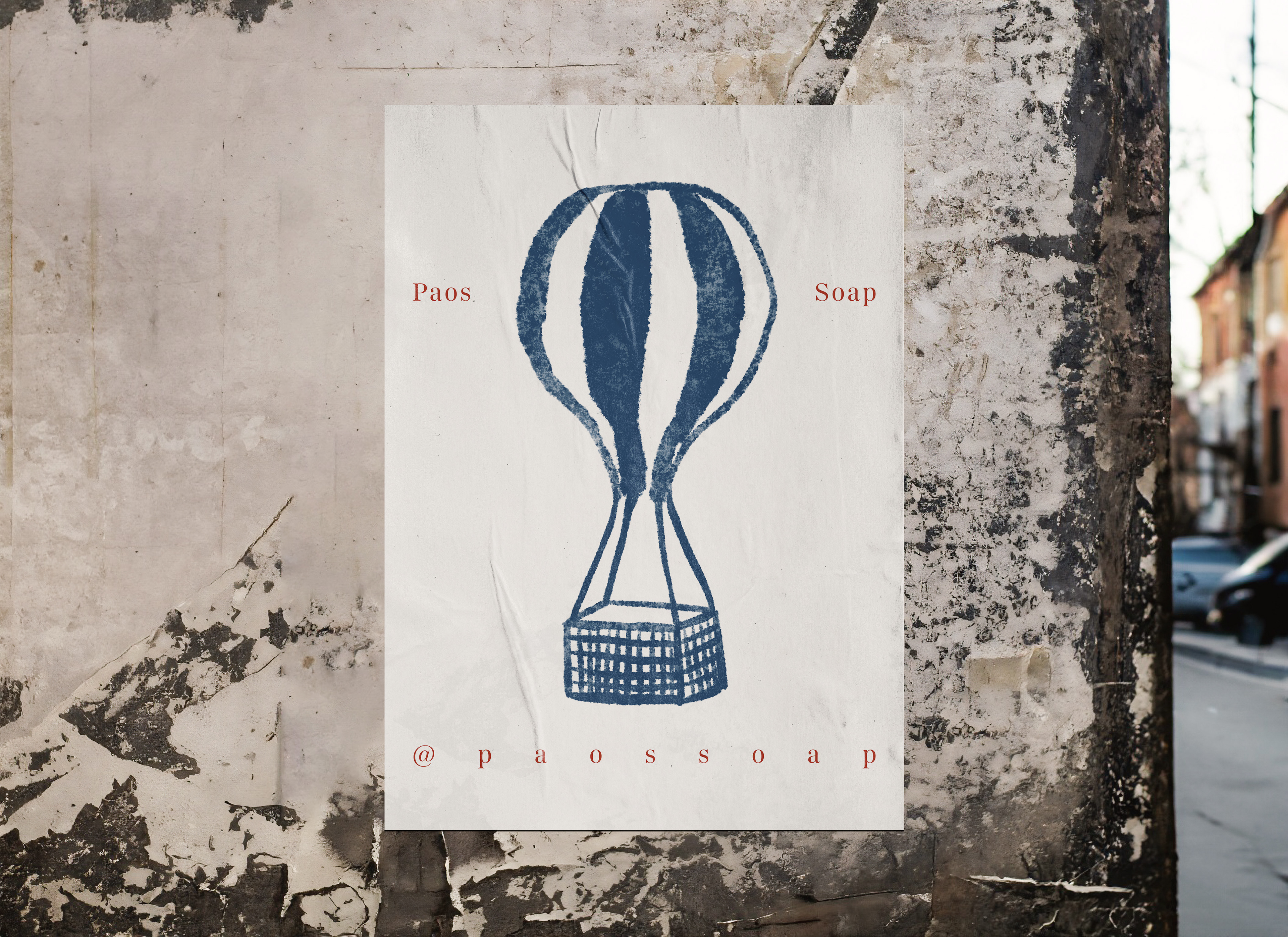
I've always had a love and appreciation for soap packaging. I've been lucky enough to visit Lisbon Portugal a few times, and each I felt very inspired by their vast and extremely beautiful range of soaps.
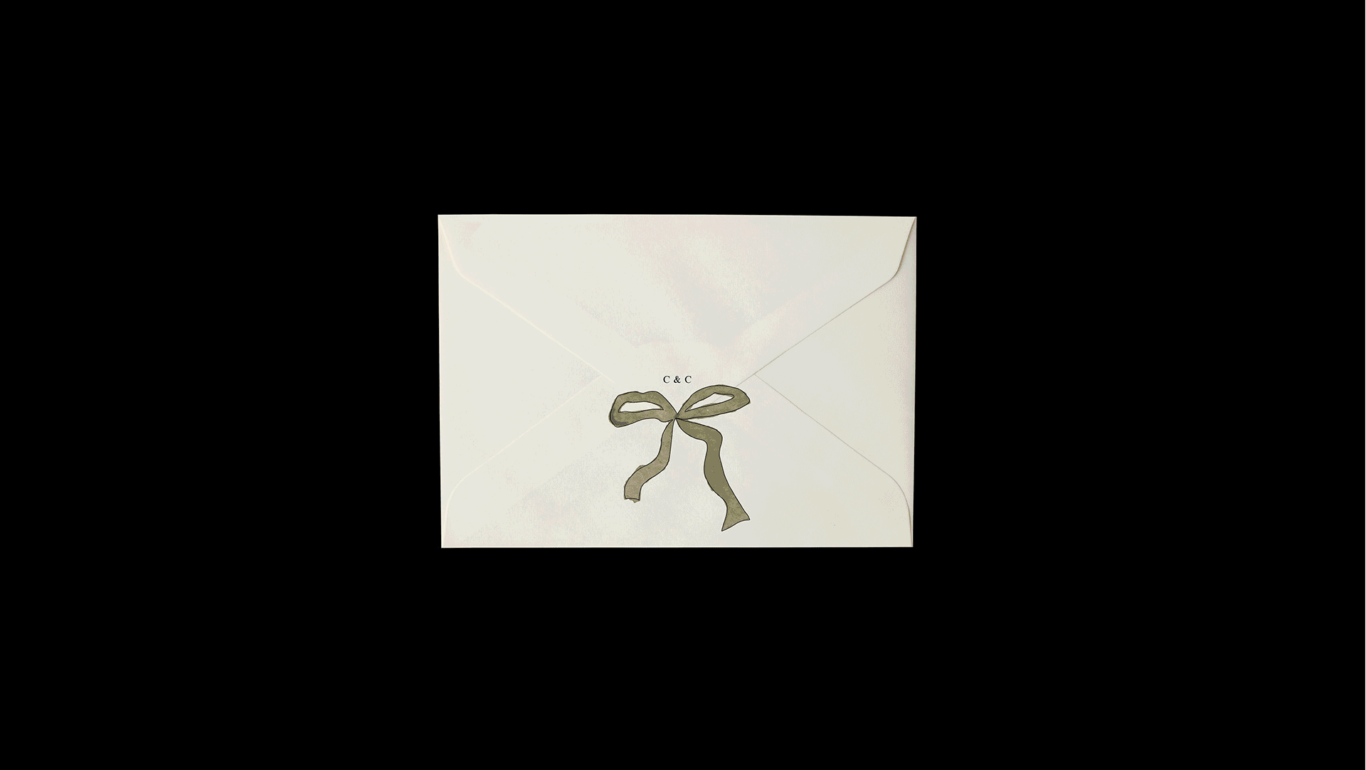
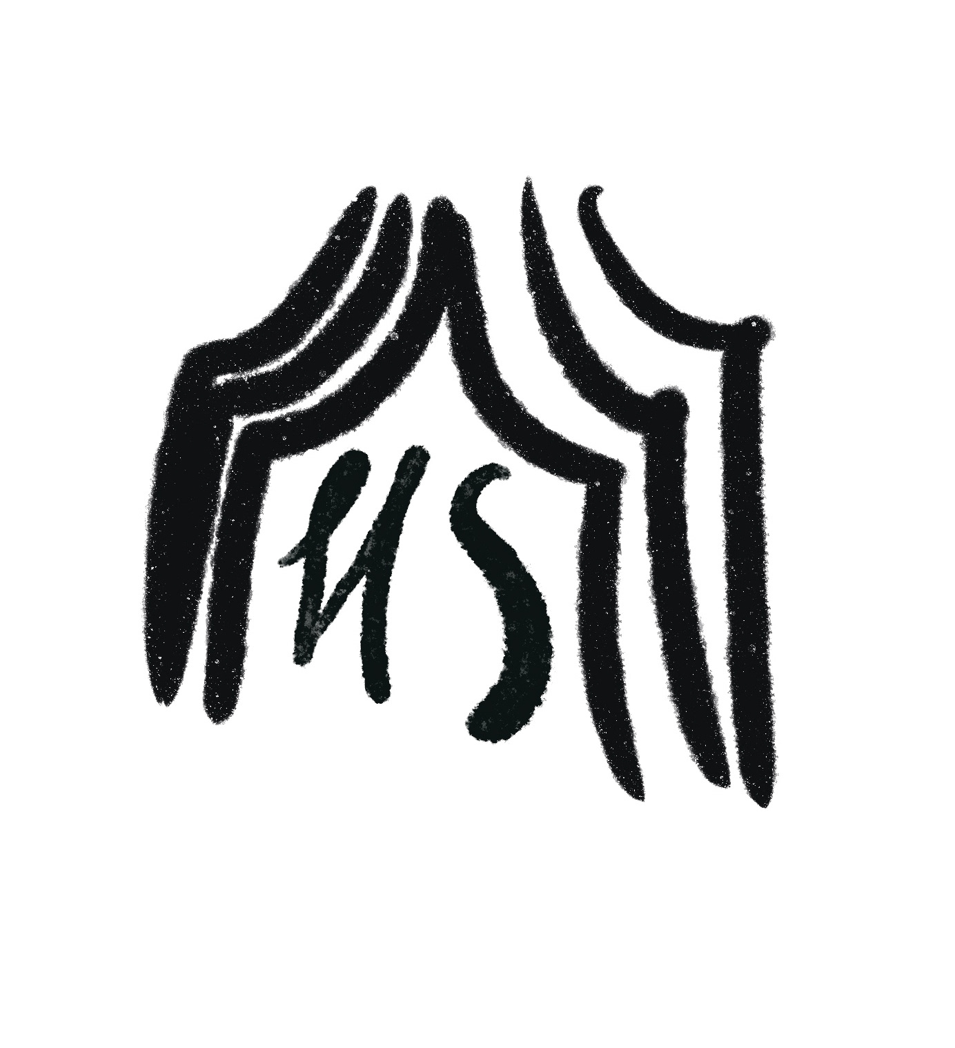
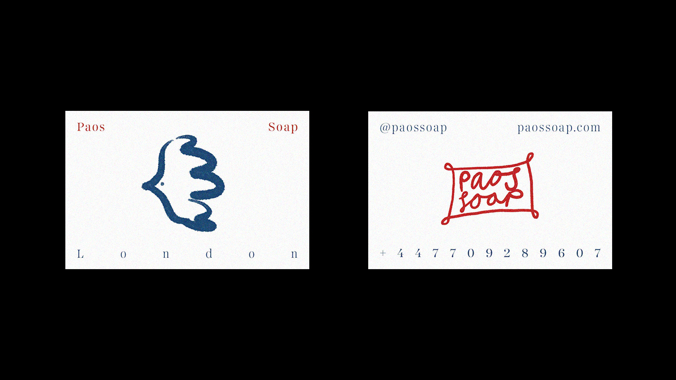
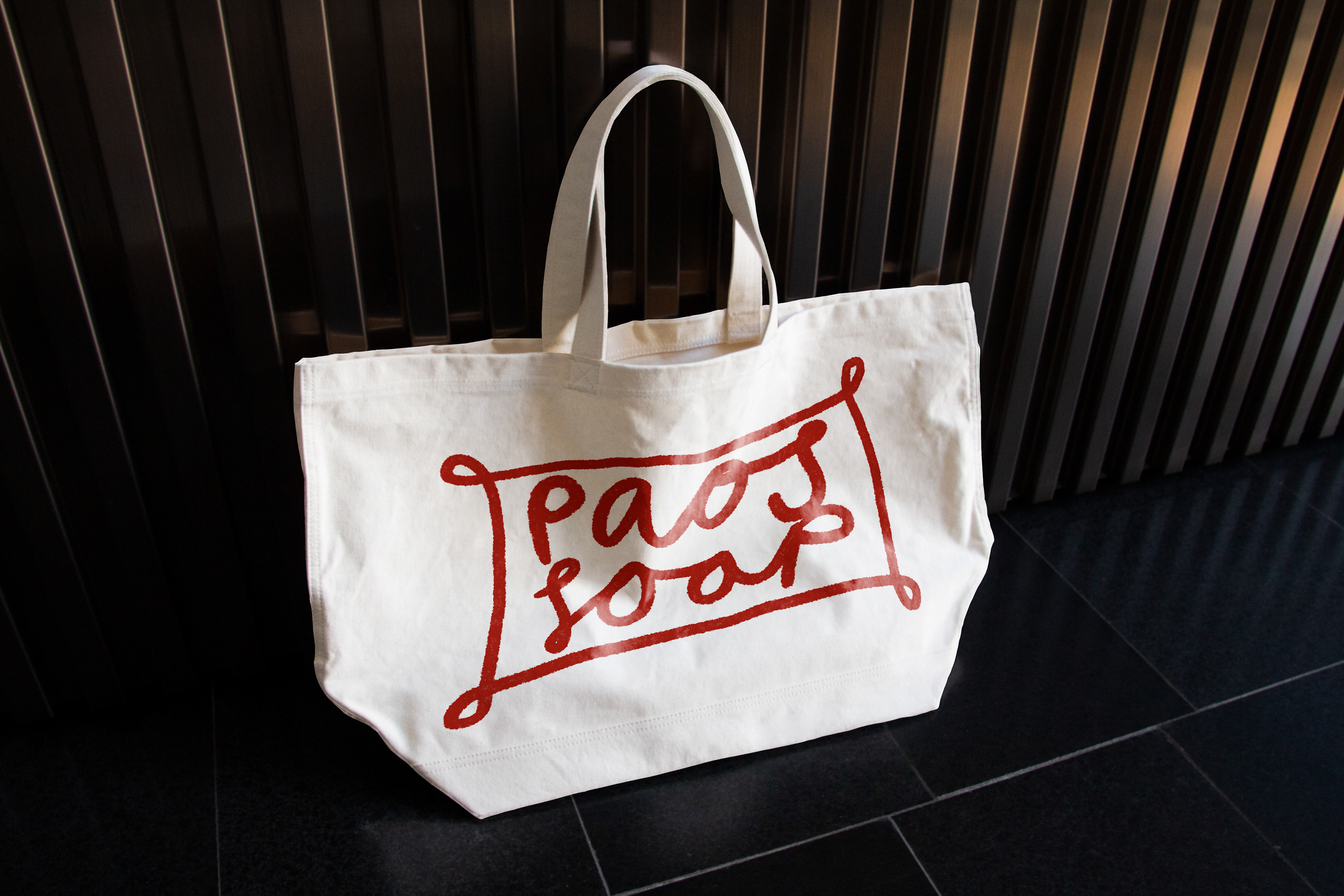
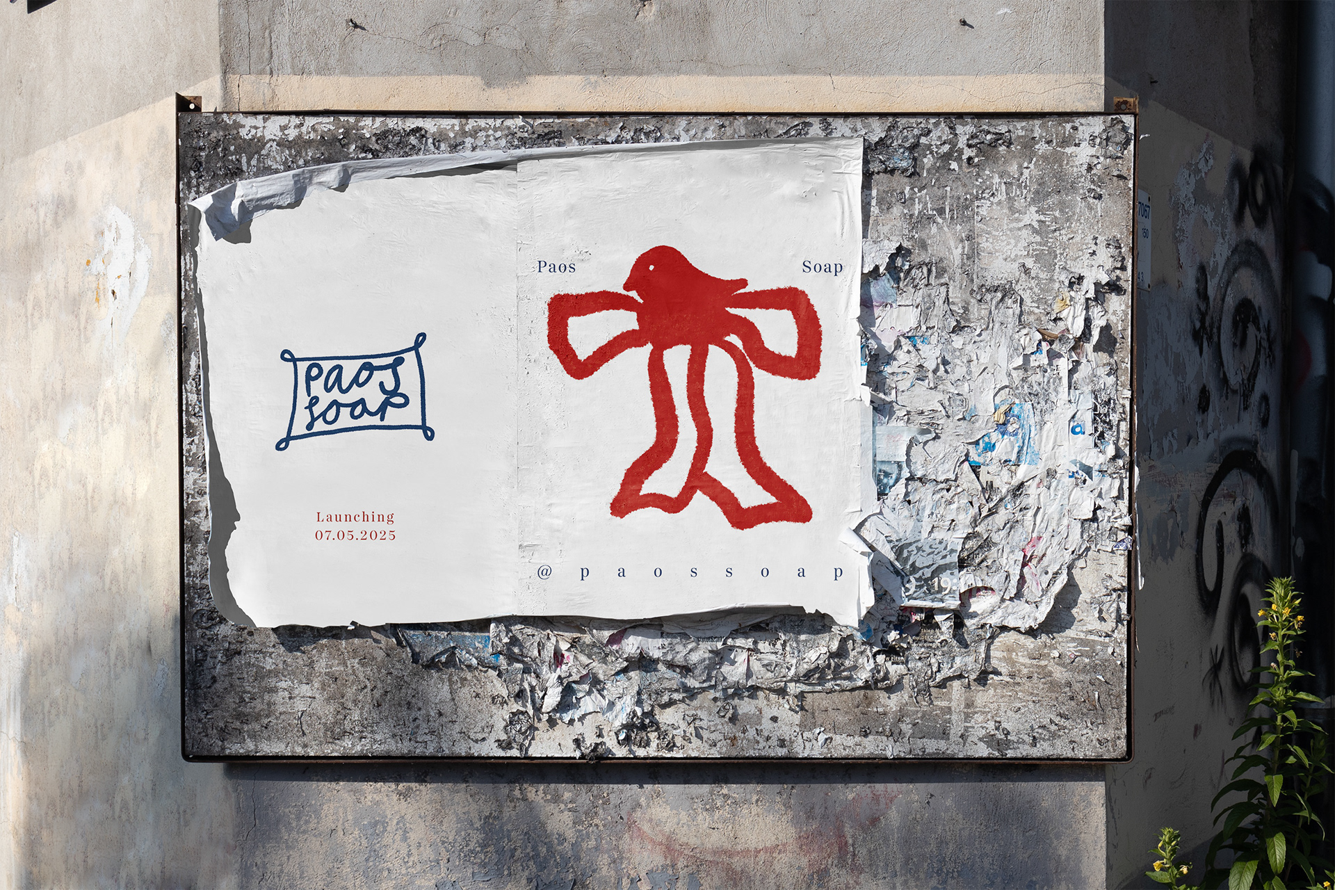
The name Poas is soap spelt backwards. I thought it had a nice ring to it and has a sense of calm and balance to it, which I associate self care with. The bird illustration in the bow was a sketch I made during a visit to the incredible home of Dennis Severs. The small bird was cosy and nestled up in a lavish bow on a mantle piece which I thought looked so peaceful and comfy.
The colour pallet was inspired during a visit to Joan Miro's museum in Mallorca. His use of primary colours was really refreshing and a reminder of effective red and blue compliment one another. I really enjoyed this project and feel as though it very much represents me and my design style.